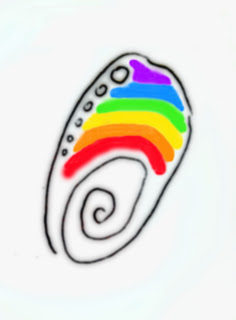


Above is the progression of development of variations of a potential logo for UCSB's Shoreline Preservation Fund (SPF), now hereby called Coastal Fund (CF). I worked on this logo in the fall of 2007, maybe around October. Why? Well, it was a very rough time for me. I wanted to be a part of the Goleta Beach film project... and well, I received confrontation about it. Maybe it's because there were too many people involved. And I was deemed as "unreliable" and "not trustworthy." All these stigmas were derived from the Blue Horizons situation in which I was gone for a week at UC Irvine to finish my film in a distraction-free, non-creatively stifling environment. Everyone apparenty thought I dropped out of the course when I truly thought a friend of mine told the teacher that I was at UC Irvine. The lesson? Don't rely on third-party people. Direct communication is the best. This innocent action of working in privacy ultimately led to a giant miscommunication situation (which was recently resolved). Plus, I should have been enrolled in the Disabled Students Program (DSP), which I will be in the future. Then all my actions would have been legit. So, at that time in October of 2007 I was being pushed away from the Goleta Beach project. I eagerly volunteered my efforts but was chronically denied. I was humiliated in front of a pier at once point. I didn't feel wanted. Doesn't feel good at all. Especially for someone who's in no-man's land, trying to transfer schools.
So, what did I do? Create an alternative. I didn't want to work on the rock crab film yet. I wasn't mature for that. So, I went to Scott Bull and decided to try and do a film and logo for the Shoreline Preservation Fund. The film idea (though Scott Bull of CF was down for it) didn't follow through because the whole agency was going through upheaval... name changes... shifts in websites, etcetera. But a film will be for a later time.... I did design a logo though, which ultimately wasn't used. It's a great idea: abalone shell, layers of the land and ocean interconnected, bright and colorful, generic in meaning, but unique at the same time. The potential problem with the logo is that the agency is called "Coastal Fund," so at a bare minimum, you would expect a "coast" to be on the logo. *Duh* I'm slapping my forehead!
Scott Bull was complaining that their existing logo (the bright-colored oval with a tower) looked too much like a "cute school logo": it's site-specific to UCSB (the tower and the Channel Islands in the backdrop), but despite this drawback, the colors are so beautiful and the brightness reflects the level of energy and enthusiasm at UCSB. Scott needed something more generic and more "professional" because now SPF is an "established" agency now. Part of the "establishment": incumbency. Non-profit megafauna. I like it.
Then I saw the new logo, which is also above. At first I didn't like it. Disclaimer: I am going to be honest and brutal here. And I truly hope Scott Bull doesn't read this blog. Or if he ever does, he will be understanding that I am currently wearing an "art critic's hat." And in the end, my opinion doesn't matter too much anyway. I'm just one in six billion. So here goes the constructive criticism. My first adversive response to the logo was "Whoa. Talk about Corporate Environmentalism. The logo is as blah as elevator and store music, except visually not acoustically." But then, I realized that there is a Gaviota Coast design to it, but what's up with the seagull? To provide the indication that it's the coast? And the colors are so bland. The logo is generic but not distinctive, symbolic of all the necessary elements, but not clever. But, but, but... I understand. It does the job. The logo represents not just the UCSB coast, but any coastline... Anyway... Corporate environmentalism, what a concept.
My recent logo and postcard design for the Goleta Beach project went a lot better. People commented on the originality, but that's a different blog.
The basic protocol to logo design: (1) You meet the individuals and the agency / do research and experience the operations of the agency for a period of time to develop emotional attachment and drive (you cannot create meaningful art if you are not emotionally hooked) (2) You figure out the core values and purpose of the agency/individual, and you create elements that symbolize the values and purpose and goals of the entity (3) then you conglomerate the elements to make a simple logo that represents the gestalt of the organization or individual. I am not sure why, but I've been addicted to logo design since middle school. It's just something I did, out of my own will.
As for Goleta Beach stigmas and confrontations, all those things are in the past, settled. I wasn't allowed to ride on the boat, but afterwards I was allowed to be on the film crew for the Kristin Amyx interview (Goleta Valley Chamber of Commerce). Since then, I've been on nearly every single shoot. Nicole said we had great audio from the shoot and it was super that we used tripods. And the rest is history.
Stigmas slowly erase with time, but they don't wash away as fast as the pebbles in the surf zone. Human relations have their own lag times as well. In the end, we're all just giant atoms: positive attractions, negative repulsions, neutral reactions. Coexisting. Conflicting. We just operate at different scales and rates in space and time than the true atoms that are the core building blocks of our beings. Makes sense that it all scales out.
And as for the logo that I made above, that's in my back pocket, and it's free for me to use at a future time.


No comments:
Post a Comment