Showing posts with label logo design. Show all posts
Showing posts with label logo design. Show all posts
Wednesday, February 04, 2009
384. "Woven Atom" Logos for SciArtS Group at UC Santa Barbara: Lydia LeClair is a Spontaneous Genius!
In the name of the borders of chaos and order....
Below is an excerpt I wrote alongside the logos I downloaded onto http://www.picasaweb.com/stokastika.
"Winter Quarter of 2009 has become a very interesting, exciting venture, ever since the creation of a small SciArtS group, consisting of very creative, enthusiastic scientists (with very high energy budgets) who have a knack for art and care about the larger picture--the role of science in society. Last week we discussed the creation of a logo, and within a few seconds the Spontaneously Creative Lydia LeClair belched out an abstract etch that embodied "Woven Atom." It was brilliant! I fell in love with it at first sight! I worked up the logo in photoshop, experimented with different colors and lighting. Geez, I LOVE working with other people! You never know what may happen, and it can turn out SOOO GOOD! I attempted to create a logo but it's a bit too "planned" and perhaps too cluttery (I had no scanner, boohoo!). Excuses, excuses, excuses! Anyhow, I think as a whole it may not work, but the "parts" of the logo I made are infested with great ideas!"
I was scrutinizing my attempted logo and I think if I "hierarchize" the lines, then a more organize appearance may emerge. I think I better lay the dxmn demon to rest right now!


Tuesday, May 20, 2008
208. Shifting Sands of Goleta Beach, Screening at the University Arts Center, May 20, 2008


I decided that before I attend the screening that I must finally put up my major final projects for "Shifting Sands of Goleta Beach" that will serve well in an art/film portfolio. They include my poster collage, postcard collage, logo, banner design, and a song that I invented, unfortunately never manifested in complete piano form. It ends up the art I created not only represent the situation with Goleta Beach, but also summarize much of how I view all human dimensions of environmental problems. Most particularly the poster collage of the head and the environmental images inside it. *Sigh* I am sure I will be emotionally charged with memories after experiencing my first reception for Masters of Fine Arts students at UCSB, which include Alexios Monopolis and Kirsten Pisto! So excited. I will write more later. I am anticipating Alexios will have blazing amazing photography much equivalent to Manufactured Landscapes style.
Sunday, March 09, 2008
126. Blue Horizons Continued: Retroactive Comparative Logos

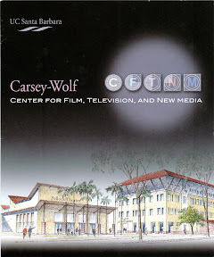



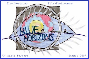

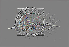
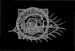



This is a blog of comparative logos. Logos are not right or wrong or good or bad. They represent a style or just represent a best fit of the portrayal of a system. When I first encountered the logos for Blue Horizons and the Carsey-Wolf Center for Film, Television, and New Media, I was in part shocked... mostly from the Carsey-Wolf logo and brochure. Mind you, this is coming from a scientist who never really hung out with any film people until this program. The Blue Horizons graphic is... well... very... conservative and academic. It seems suitable. But it doesn't exactly jump out at you. The Carsey-Wolf Center has too long of a name for a center title, and additionally, if this center is full of media experts, wouldn't they know not to create a dark, gloomy brochure? It is a brochure and logo that doesn't jump out at me in the slightest bit. I don't know, it's just my own opinion. Then from my own navel-gazing viewpoint of my own art... Let's see, my logos are (1) very layered (2) very saturated and diverse in colors. I mean, rock crabs don't have much aesthetic or sex appeal, so, I think I did a good job for making a seemingly bizarre subject kind of interesting and enticing. Okay, I'll stop the ridiculousness of self-glorification! I guess this situation shows the variation in perception of the same system.
I think one of the undergraduate students of the course was getting paid to make a logo for Blue Horizons, but I never saw what happened. As soon as I found out about this, I think that very night I constructed my own logo, starting with the eyeball, then planet earth, then the sun, then the camera, then the channel islands, and then Blue Horizons written on top. Lots, of layers. Insane! I didn't get paid but my own mind's heart was paid very well through this artistic exercise.
I feel good critiquing art. Why? Because I'm not right or wrong, and no one has to take me seriously since critiquing art is an opinion, and critiquing science isn't necessarily the case.
Friday, March 07, 2008
119. Coastal Fund Logo Change at UC Santa Barbara, Fall Quarter 2007


Above is the progression of development of variations of a potential logo for UCSB's Shoreline Preservation Fund (SPF), now hereby called Coastal Fund (CF). I worked on this logo in the fall of 2007, maybe around October. Why? Well, it was a very rough time for me. I wanted to be a part of the Goleta Beach film project... and well, I received confrontation about it. Maybe it's because there were too many people involved. And I was deemed as "unreliable" and "not trustworthy." All these stigmas were derived from the Blue Horizons situation in which I was gone for a week at UC Irvine to finish my film in a distraction-free, non-creatively stifling environment. Everyone apparenty thought I dropped out of the course when I truly thought a friend of mine told the teacher that I was at UC Irvine. The lesson? Don't rely on third-party people. Direct communication is the best. This innocent action of working in privacy ultimately led to a giant miscommunication situation (which was recently resolved). Plus, I should have been enrolled in the Disabled Students Program (DSP), which I will be in the future. Then all my actions would have been legit. So, at that time in October of 2007 I was being pushed away from the Goleta Beach project. I eagerly volunteered my efforts but was chronically denied. I was humiliated in front of a pier at once point. I didn't feel wanted. Doesn't feel good at all. Especially for someone who's in no-man's land, trying to transfer schools.
So, what did I do? Create an alternative. I didn't want to work on the rock crab film yet. I wasn't mature for that. So, I went to Scott Bull and decided to try and do a film and logo for the Shoreline Preservation Fund. The film idea (though Scott Bull of CF was down for it) didn't follow through because the whole agency was going through upheaval... name changes... shifts in websites, etcetera. But a film will be for a later time.... I did design a logo though, which ultimately wasn't used. It's a great idea: abalone shell, layers of the land and ocean interconnected, bright and colorful, generic in meaning, but unique at the same time. The potential problem with the logo is that the agency is called "Coastal Fund," so at a bare minimum, you would expect a "coast" to be on the logo. *Duh* I'm slapping my forehead!
Scott Bull was complaining that their existing logo (the bright-colored oval with a tower) looked too much like a "cute school logo": it's site-specific to UCSB (the tower and the Channel Islands in the backdrop), but despite this drawback, the colors are so beautiful and the brightness reflects the level of energy and enthusiasm at UCSB. Scott needed something more generic and more "professional" because now SPF is an "established" agency now. Part of the "establishment": incumbency. Non-profit megafauna. I like it.
Then I saw the new logo, which is also above. At first I didn't like it. Disclaimer: I am going to be honest and brutal here. And I truly hope Scott Bull doesn't read this blog. Or if he ever does, he will be understanding that I am currently wearing an "art critic's hat." And in the end, my opinion doesn't matter too much anyway. I'm just one in six billion. So here goes the constructive criticism. My first adversive response to the logo was "Whoa. Talk about Corporate Environmentalism. The logo is as blah as elevator and store music, except visually not acoustically." But then, I realized that there is a Gaviota Coast design to it, but what's up with the seagull? To provide the indication that it's the coast? And the colors are so bland. The logo is generic but not distinctive, symbolic of all the necessary elements, but not clever. But, but, but... I understand. It does the job. The logo represents not just the UCSB coast, but any coastline... Anyway... Corporate environmentalism, what a concept.
My recent logo and postcard design for the Goleta Beach project went a lot better. People commented on the originality, but that's a different blog.
The basic protocol to logo design: (1) You meet the individuals and the agency / do research and experience the operations of the agency for a period of time to develop emotional attachment and drive (you cannot create meaningful art if you are not emotionally hooked) (2) You figure out the core values and purpose of the agency/individual, and you create elements that symbolize the values and purpose and goals of the entity (3) then you conglomerate the elements to make a simple logo that represents the gestalt of the organization or individual. I am not sure why, but I've been addicted to logo design since middle school. It's just something I did, out of my own will.
As for Goleta Beach stigmas and confrontations, all those things are in the past, settled. I wasn't allowed to ride on the boat, but afterwards I was allowed to be on the film crew for the Kristin Amyx interview (Goleta Valley Chamber of Commerce). Since then, I've been on nearly every single shoot. Nicole said we had great audio from the shoot and it was super that we used tripods. And the rest is history.
Stigmas slowly erase with time, but they don't wash away as fast as the pebbles in the surf zone. Human relations have their own lag times as well. In the end, we're all just giant atoms: positive attractions, negative repulsions, neutral reactions. Coexisting. Conflicting. We just operate at different scales and rates in space and time than the true atoms that are the core building blocks of our beings. Makes sense that it all scales out.
And as for the logo that I made above, that's in my back pocket, and it's free for me to use at a future time.
Saturday, September 29, 2007
Bella Nova Productions Logo Sketches, with Oscar Flores and Dulce Osuna, My Mind is Drifting Elsewhere


Introductory aside note: the websites of Oscar Flores and Dulce Osuna have some of my photographs on them!
http://www.uweb.ucsb.edu/~oflores
http://www.uweb.ucsb.edu/~dulceosuna/
Last weekend, I had a couple of free days (though the shxt hit the fan a few days later), and Oscar had a Quincenera to film on Saturday. I volunteered to help out, and it was a lot of fun! It was a blast and a total escape from my current anxieties of trying to transfer back to UCSB with an interdisciplinary Ph.D. As another random aside, I met Edgar, who is one of the managing heads of the famous Freebirds burrito restaurant in Isla Vista, and I don't know how he related to the quince girl, but I said hello (he teased me for my late night purchases of chips and raids of pico de gallo in large water cups) and said that my dad absolutely cannot wait to come up to UCSB all the way from Riverside and have a Freebirds burrito!
Towards the end of the Quincenera, Oscar and I got really bored. We didn't take the event too seriously because we weren't getting paid, though it is indeed a resume item. Oscar needed help with making business cards, and I gave him some pointers. Also I did a photoshoot of Oscar right then and there, and he liked a few of the images! He placed a few on his website! Happy Vic. Then we also sat down and talked about how the BellaNova Productions logo (Bella Nova Productions is a production company that Oscar and Dulce are starting, and I am going to try to help as much as possible, though right now I am SO stressed out). Yesterday and today I worked on the logo, and the best drawings and photoshop manipulations are above.
The process of making the layers of the logo can be seen on this website:
http://s202.photobucket.com/albums/aa109/stokastika/BellaNovaProductionsLogoSketches/
I want to do better, but I am so full of anxiety, my mind is not focusing like it optimally can. Especially yesterday, when I got blasted with an unexpected phone call from the assistant Dean of the Graduate Division at UCSB (phone call? HOW INHUMANE! THIS IS MY ACADEMIC LIFE HERE. MY BRAIN. DON'T CALL ME. JUST TALK TO MY FACE, PLEASE!). She was nice but discouraging at the same time. And I talked to Shine, Miriam asked me, "Why isn't there a CCS Ph.D?" I'm shrug my shoulders, "I don't know." And I told Shine of this. Shine Ling. Like my undergrad role model in CCS biology. He has profoundly impacted my life intellectually. Shine, who has compiled an extensive history of the College of Creative Studies (an education and philosophy of science journalism project he has been working on) Shine told me two things (or 3) based on my circumstance: (1). In the Conceptual Plan of CCS a long time ago, they had an idea of creating a graduate school, (2). Since Bruce Tiffney is el heffe for now, he is the type of person who could really carry through such an idea (but shxt, it's a frickin' hassle!), Shine further stated that after Dr. Ashby retired, this is the first time in a while where CCS can operate in "non-crisis mode" (3). Though CCS advertises itself to be "graduate school for undergraduates," this is in great part, highly untrue. There kind of needs to be a CCS graduate school because CCS has very different philosophies and operations than typical graduate school. Shine also has found some interesting statistics that many CCS alumni who have attempted graduate school have actually not carried through (though many have, and sucked it up).... I am literally in the middle of a human graduate education guinea pig experiment! I think, and Shine agrees, that many CCS graduate students are suffering in the outer world in general. Because society can only accept and deal with people who FIT into boxes, and don't know what to do with people who CREATE their own boxes. In the end of the evening at Quantum (an academically-named, Japanese-architecture, high-class, locally-distributed, organically-rich, swank American burger joint, okay... only in Santa Barbara....), after all my griping and bullshxtting to him and Jay and Eleanor (and poor Sam, CCS Literature, she doesn't need to hear this!), Shine said he would talk to Bruce about some kind of CCS grad school, whenever he saw him next.
As you can see, my mind is NOT involved in making the logo. My mind is wrapped around my institutional re-incorporation of my brain. It's about mental survival. And physical, consequentially... affecting eating habits, sleeping habits, exercise habits, affecting my emotional stability--I had a mild panic attack yesterday but managed to express it through my voice recorder.... And writing about this has been therapeutic as well....
I have an alternative name for a Production Company. Since I am into "The Matrix" so much, I decided that a cool name would be "NeoNova." It has a COOL ring to it, plus can make a NIN-nine-inch-nail type of logo to it. I think New Star more accurately represents me and "a new birth of thought." Bella Nova is great. Beautiful Star. But in certain ways to me is a bit static. I think I need that sense of "birth" and "change" and "renewal" in a name for me. Bioweb. Evoterre. Eklektecos. Stokastika. Biomathematika. I mean, these names spur images of flow and change and shifts and growth and birth and death and ... and... systems moving in general. Don't get me wrong, Bella Nova is a great name for this production company, but in my own fictictious circumstance, it would be NeoNova.
A last thought. I told Shine: CCS versus graduate school. Graduate School is a socially acceptable form of entering a gang. Instead of getting physically beat up with blood and guts, you go through bureacratic constipation paperwork and interviews, "mentally beat up" "firing squad." And not only that, they pass your through first year entry classes to make sure that you thoroughly think like their little Intellectual Ingroup Thinktank--little clones of them--and then you are a part of the "ingroup." So there. Undergraduates in Letters and Science get hearded around like numerical cows, branded with a pin, who have the illusion of choice, taking classes because it "satisfies 1 from column A and two from column B" as Bruce Tiffney would say. How mind-numbing! So, there's the epitome of bureaucratic cow-herding and gangsterism of undergrad and grad school. Now, what is CCS? CCS is like lifting all constraints and walls and arbitrary and irrational bureaucratic rules of all departments and disciplines, and rules of society in general (not ALL of them), and let students run around and play in the university like little ADD kindergarteners, who are curious about everything, and just let their intellectual growth be guided by their own INDIVIDUAL INTERNAL QUESTIONING, rather than being ditcated by intellectual gangterism and cow-herding! CCS promotes integrative thinking and renaissance thought (fosters INDIVIDUAL INTELLECTUAL GROWTH AND DEVELOPMENT OF INDIVIDUAL INTELLECTUAL IDENTITY). CCS allows you to take bits and pieces of knowledge from any department, field, person, inside and outside the university--and integrate all these bits and pieces into something new. A bunch of people of all different disciplines shootin' the shxt in a beat up couch in an old World War II building. CCS is the romantic notion of the university that USED TO EXIST in the past that basically... no longer exists anymore... except for CCS. In the end, I take a step back, and I find this all disgusting. Bureacracy is mentally constipating and killing me, and I am tired of fighting it. "What is rational versus what is bureaucratic convention are two ENTIRELY different entities." This is truly a Rage Against the Machine. The summation of human society across large numbers of people and resources across several generations, has created a MONSTER, INHUMANE system that people can barely exist in--to a point where most of American society is drugged and cell-brain-dead (college-based ritualistic rite of passage) in order to stay in their "molecular places" where society wants them to stay.
It's like this entire illusion of choice. This gradient to a degree of mental freedom to degrees of constraint. And what maximized degrees of mental freedom? CCS. CCS. CCS. And what constrains it? L&S. Grad school. And what program fosters INDIVIDUAL INTELLECTUAL IDENTITY? INTELLECTUAL WAIFS WITH A HOME BASE? ORGANIC-FREE-RANGING INTELLECTUAL THOUGHT AND NOT-MASS-PRODUCED CLONES? CCS. And the rest is just prison. Period. Dxmmit.
I AM A GUINEA PIG. THIS IS HOW SYSTEM BUREAUCRACY IMPACTS, INFLUENCES, AND TORMENTS INDIVIDUAL PSYCHOLOGY. THIS IS ME. DXMMIT. I REFUSE TO TAKE PILLS, DXMMIT. I AM NOT SICK. THE SYSTEM IS MAKING MY SICK. DON'T QUESTION YOURSELF. I'M FINE. QUESTION THE SYSTEM. THE SYSTEM IS MAKING US ALL SICK.
AND I'M NOT GOING TO WAIT FOR A 25-YEAR ACADEMIC INTELLECTUAL RITE OF PASSAGE (Ph.D. tenure, etcetera) IN ORDER TO BECOME AN INTELLECTUALLY ORGANIC FREE-RANGER. The problem of the environment is NOW. My survival is today. My survival, our survival, and the EARTH'S PROBLEM IS NOW. NOW. NOW. We need solutions and changes NOW. Every day a scientist conforms to existing bureaucracy and stays in the comfort of his air-conditioned office. Every day a bureaucrat goes about his or her business without questioning the way how he or she has framed or constrained this university environment. Every single day, these people are giving up on themselves. Given up on future generations. Given up on this planet. We are a PART of the experiment of sustainability! All these godxm repeat plaguing thoughts in my head! Get them out!
I see the university structure more like an experiment in human behavior... and it sucks I have to be the victim of it... as of this mentally perilous moment.
I need to see Armand next week. Bruce next week. And Ron Rice next week. And Zia next week. I don't think I can write the letters yet until I know what they have to say.
Sorry if I have any strange cuts-and-pastes in this partially frustrating, cuss-out blog.
Key Words: bella nova, CCS graduate school, Dulce Osuna, graduate school for undergrads, logo design, NeoNova, Oscar Flores, production company, quincenera, Shine Ling, cow-herding, intellectual gangsterism, intellectual identity, university romanticized, rage against the machine, bureacuratic monster, illusion of choice, organic-free-ranging intellectual thought, guinea pig
Subscribe to:
Posts (Atom)